Project Brief
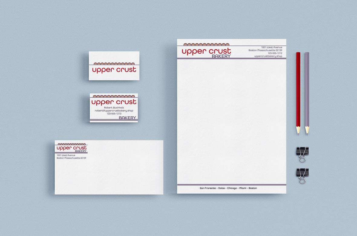
School Project – The Upper Crust bakery project was a predefined brand without any brand components. A logo and color palette were created to align with the bakery brand. The repeating arches act as a visual metaphor for breads or the edge of a pie crust. The same shape was designed to be repeated in the architecture of the physical store locations. The awning outside would use the same pattern as well as an awning inside over the main showcase and checkout counter. The typography uses a sans-serif font with deep bowls and long descenders to match the arch shape in the main icon.
Specifications
- Adobe Illustrator
- Adobe Photoshop
- Adobe Acrobat
- CMYK